Top Down Design Approach: Mobile Site for Realtors
 This is the fourth in a series of articles about Broker/Agent Real Estate Websites. Now we dig into to the mobile design.
First the Non Goals of my Mobile Site
- Not every page needs a counter mobile page.
- For the pages in need of a mobile solution, not all of the desktop content needs to be included. The majority of the content – yes, but it has to be easily and quickly navigated.
- Mobile does not have to work on every device. The desktop looks fine on tablets, so mobilce needs to focus on smart phones only.
Of course, these are My Non-Goals and Goals. This was designed for my target audience looking for a specific property or an open house. The full desktop version will manage other requests.
There are three options for serving the design:
- Responsive design
- Different content on the same URL
- a mobile subdomain with different content and different URLS
Google’s recommended choice is a “Responsive Design” where your CSS reacts to the screen width, same content, different CSS, same URL.
For the complete design details check this out by google Building Smartphone Optimized Sites
I went with option 2, it was an easy choice based on development time. To convert each page which I wanted a mobile solution took just a few hours. I determine the user agent and serve the mobile or desktop page. A responsive design, would have taken a few days per page and possibly required rewriting the CSS for the desktop which was already highly optimized. Plus I had already decided not to carry all of the content over.
The reason the development went so quickly was jQuery Mobile. Most of the design was done on-line using the ThemeRoller and copied into my IDE.

Here is the final product New England Premiere. Since the same URL serves desktop and mobile – you will need to look at the link from your phone to see the jquery design.
And the Google User Experience Grade…
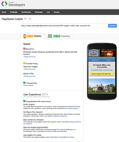 Note: Only scored an 80 on the mobile version because jquery and some css were required in the header of the document. I could not easily make that non-blocking.
What are your thoughts? Does this work? How are you approaching your mobile design? Feedback is always appreciated.
Next I will look into content, looking for that unique data set to add.

Bryn Kaufman
Posted at 10:30h, 17 FebruaryHi Mark,
The design looks good and fits well when holding my iPhone vertically.
I wanted to let you know what a screen shot looks like on my iPhone when I hold it horizontally, as you will see the buttons cover the text.
https://dl.dropboxusercontent.com/u/67975768/MobileScreenShot.PNG
I am not sure I agree with your decision to drop the additional photos. NAR has told us the thing buyers want to see most is photos, and it is the first thing they look at. Mobile phones tend to be very good at displaying photos, so I would have liked to see all the photos still.
Thanks for sharing.
Mark Hankel
Posted at 17:21h, 17 FebruaryHi Bryn,
Thanks for the feedback. I will take a look